
The MN T-Girls have had two logos over the years and it’s time for a new one.
The first two were designed by me but after seeing my friend Blanca’s work I thought she would be able to design the perfect logo.
I was wrong. She designed THIRTEEN perfect logos.
I picked out my five favorites and then thought I’d open it up to everyone to see if there’s an overwhelming favorite.
So, without further ado, which one stands out to you? Please comment below and help me make up my mind.
Thank you to Blanca for her amazing design.
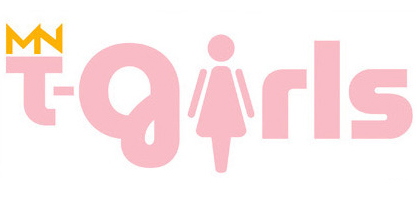
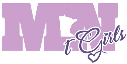
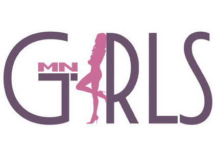
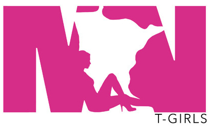
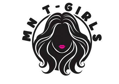
Love, Hannah

Nice! I vote for #2
LikeLike
agree
LikeLike
the third one defo!
LikeLike
The 3rd one down.
LikeLike
Definitely #2; #3 is clever but a bit too subtle (the “T” is almost lost).
LikeLike
I don’t live in MN, but my favorite is #2.
Hugs, Tina
LikeLike
The second one looks good to me.
Linda ________________________________
LikeLike
Second one.
Also it would be great if you can write an article on how you started the group, I am wanting to start a similar group in my city.
Thanks
Nicole
LikeLike
Hi! I hope this helps!
Good luck!
Love, Hannah
LikeLike
I seem to be in the minority. I prefer the 4th, with the third, my second choice.
LikeLike
I’m also in the minority, the first one is cute. #1 or #3.
LikeLike
I like the the first one as it seems to be all inclusive regardless of body type, etc.
LikeLike
fav is #2, and I thought of a subtle detail to honor the founder. In the letter G’s descender with the heart that appears like a lower case “m”, in the lower left ventricle, the artist could add a subtle interior mark to make it appear as an “h”. hm (mmmmmm)
LikeLike
I like the first one, but maybe print it with a littler darker color pink as to stand out more… Mary Jo
LikeLike
and make the g more easily to read,, there is a small cap version that is neat looking i’ve seen..
LikeLike
#1 stands out to me.
LikeLike
Oh my! I see why you can’t make a choice. 2 and 4 look similar and too bulky for my taste. I like how 1 and 3 feel lighter, more delicate and feminine. They’re all beautiful though.
Josie
LikeLike
Try a diff. color MN and with a different looking script, more feminine??? Black print with red lips kiss above it.. Mary Jo
LikeLike
I like the fifth one. Rhiannon
LikeLike
Pair the “t-Girls” script of the second option (because it looks cute!) with the “MN” from Option #1 (it’s a crown for a queen, ya know).
LikeLike
I like no5, it’s, kind of sassy
LikeLike
Hannah I definitely like #3the best.
Kerri
LikeLike
Either #2 or #3 would a fabulous choice for a new MN T-Girls logo! Thanks for asking for input!
LikeLike